How might we create a digital tool to help patients and families with Duchenne Muscular Dystrophy navigate their journey?
DMD Journey Map Tool
While working at Live Well Collaborative, a non-profit design agency in Cincinnati, I created an interactive, web-based Journey Map application that visually educates patients and families about Duchenne Muscular Dystrophy (DMD) and its treatment path from childhood through adulthood. This tool was meant to be filling a gap that currently exists within online resources for patients and families as well as equipping them with extra knowledge outside of the doctor's office.
- My role
- Design Research Intern
- When
- June – August 2021
- For
- Cincinnati Children’s Hospital Medical Center — Division of Palliative Care
- Methods
- UX/UI Design, User Interviews, User Testing, Design Research Activities, Sketching, Wireframing
Outcome Built the tool’s information architecture from interviews and a card sort that grouped content into medical, emotional, and lifestyle categories, then refined it through user testing.
Overview
THE BACKGROUND
Working with Cincinnati Children’s Division of Palliative Care we explored what a digital journey map tool could look like for patients and families with Duchenne Muscular Dystrophy. This project was a continuation from the previous semester where the team identified unmet needs and came up with the interactive journey map initial concept. Our team continued the research and worked on developing and refining the digital tool.


Duchenne Muscular Dystrophy (DMD) patients deserve high-quality patient and family-centered physical, psychological, emotional, social, and spiritual care to improve their lives at every stage of their illness.

There currently isn’t a well developed single source of information to cover the range of topics that are important to DMD patients and families.
PROJECT GOALS
Define Stakeholder Use Cases
Clinicians, parents, and patients could all be users of this interactive tool. We needed to define how each of them would use it differently, and how that could affect the UX of the site.
Define What Makes This Tool Unique
This tool is not meant to be just another website that lists information about DMD. We needed to look at existing resources and make sure that we are providing something that is filling in an existing gap and creating more value.
Keep it Simple and High Level
The goal of the tool was not to replace conversations with clinicians or give the patient and family all of the information. Rather, its intended use is to better prepare them to have future conversations and connect them to different resources about important topics.
Research
UNDERSTANDING THE TOPIC SPACE: SECONDARY RESEARCH
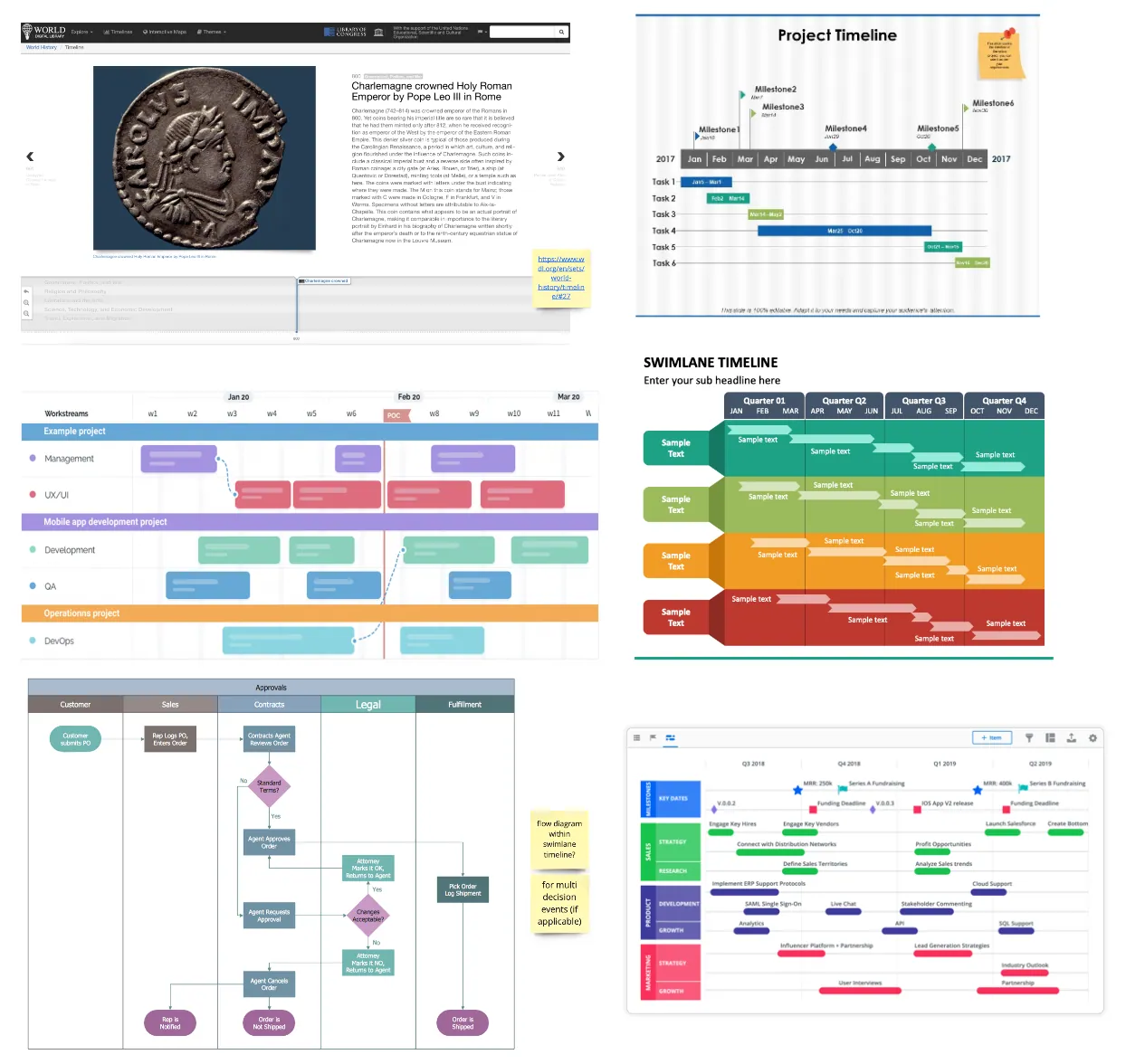
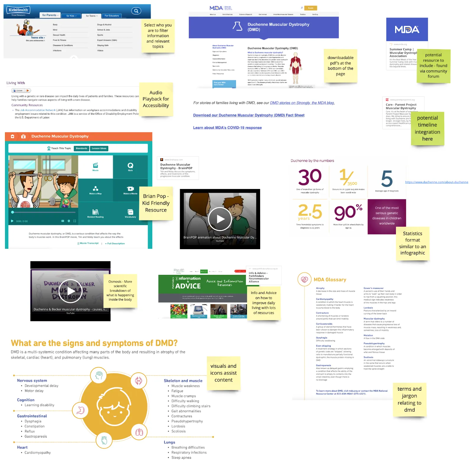
When starting this project it was important to familiarize myself with the specifics of Duchenne Muscular Dystrophy. I wasn’t familiar with this diagnosis in the past, so I looked at some existing resources to learn more about what DMD is, as well as to start benchmarking sites to see what is already out there in terms of information about different topics and resources.
THE USER PERSPECTIVE: USER INTERVIEWS
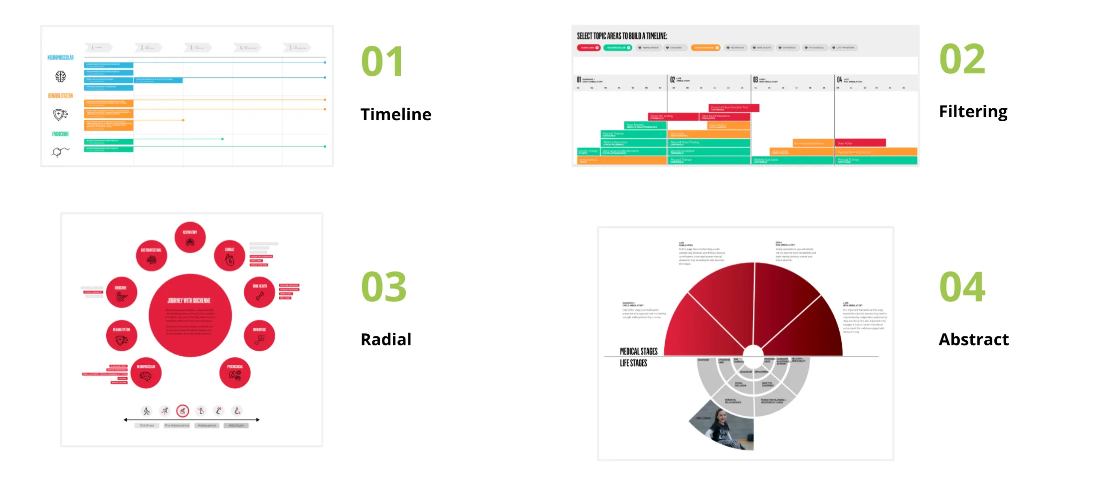
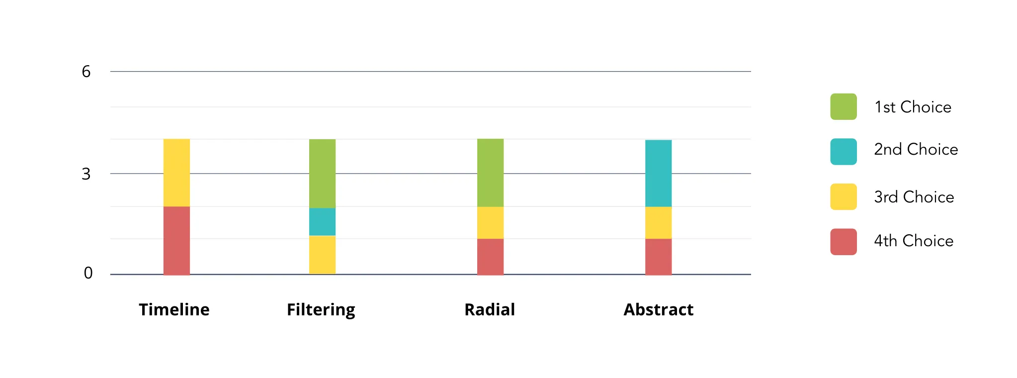
Our team also led user interviews where we had the opportunity to talk directly with DMD patients and their families as well as Clinicians who work with them. Our interviews with the clinicians helped validate and understand content that could be included in the tool based on their specialty, as well as understand how they would use it to help parents/patients. Our interviews with the patients and families helped us understand how they would want content organized and grouped, and identify gaps in content and what is still missing. We also got their feedback on different layout ideas to understand what would be more intuitive for them to use.
View Interview Guide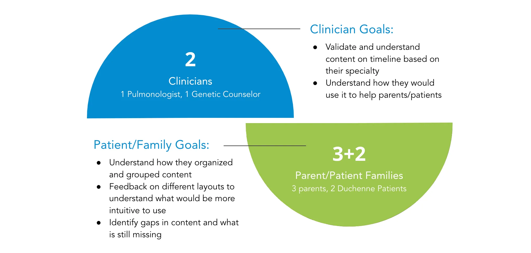
USER INVOLVEMENT: CARD SORTING ACTIVITY
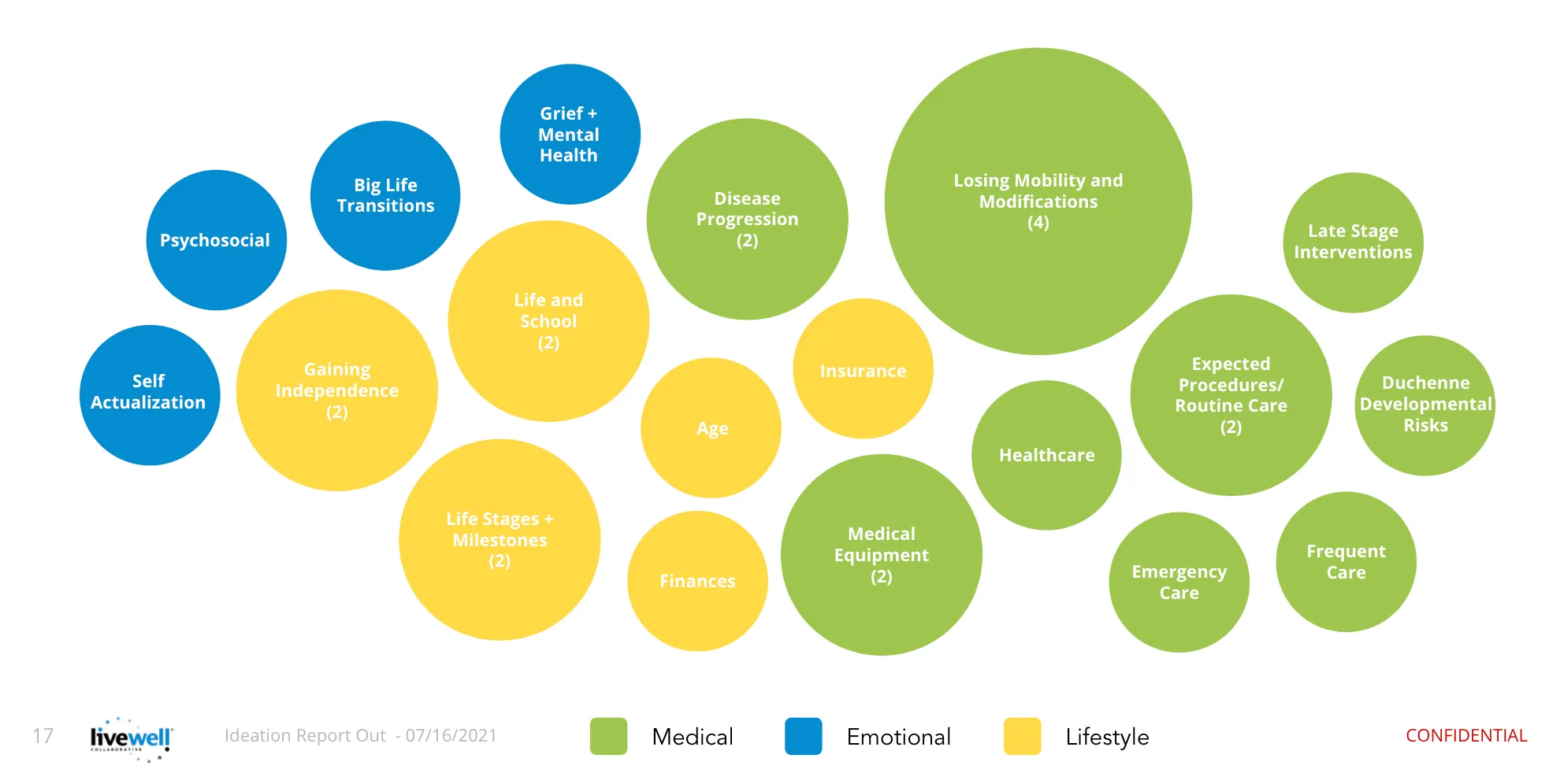
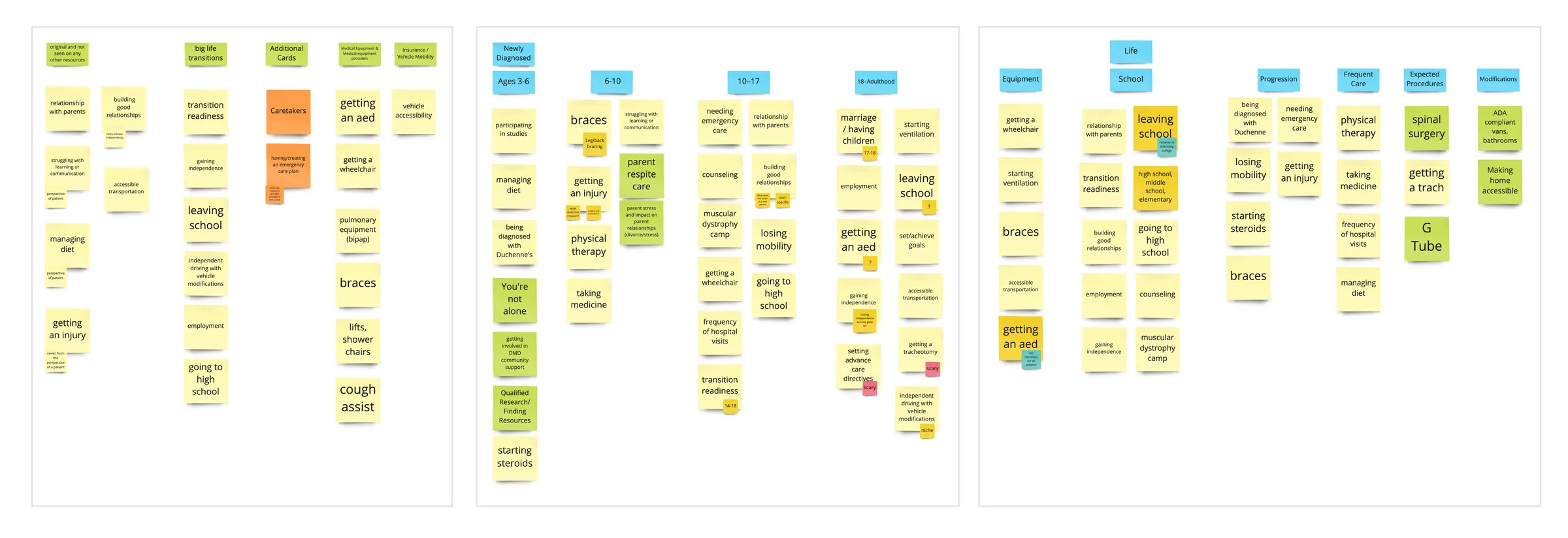
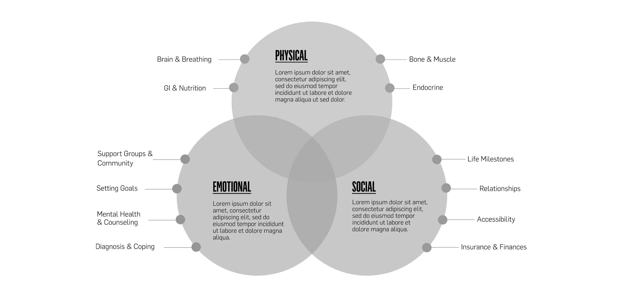
Along with general user interviews we did a card sorting activity with DMD patients and their families. These card sorting activities were used to understand how patients and parents thought about and categorized different topic areas that they would find on a Duchenne resource website. The results of the card sorting activity helped us identify and divide the information on the site into 3 main categories: medical, emotional, and lifestyle.
Ideation
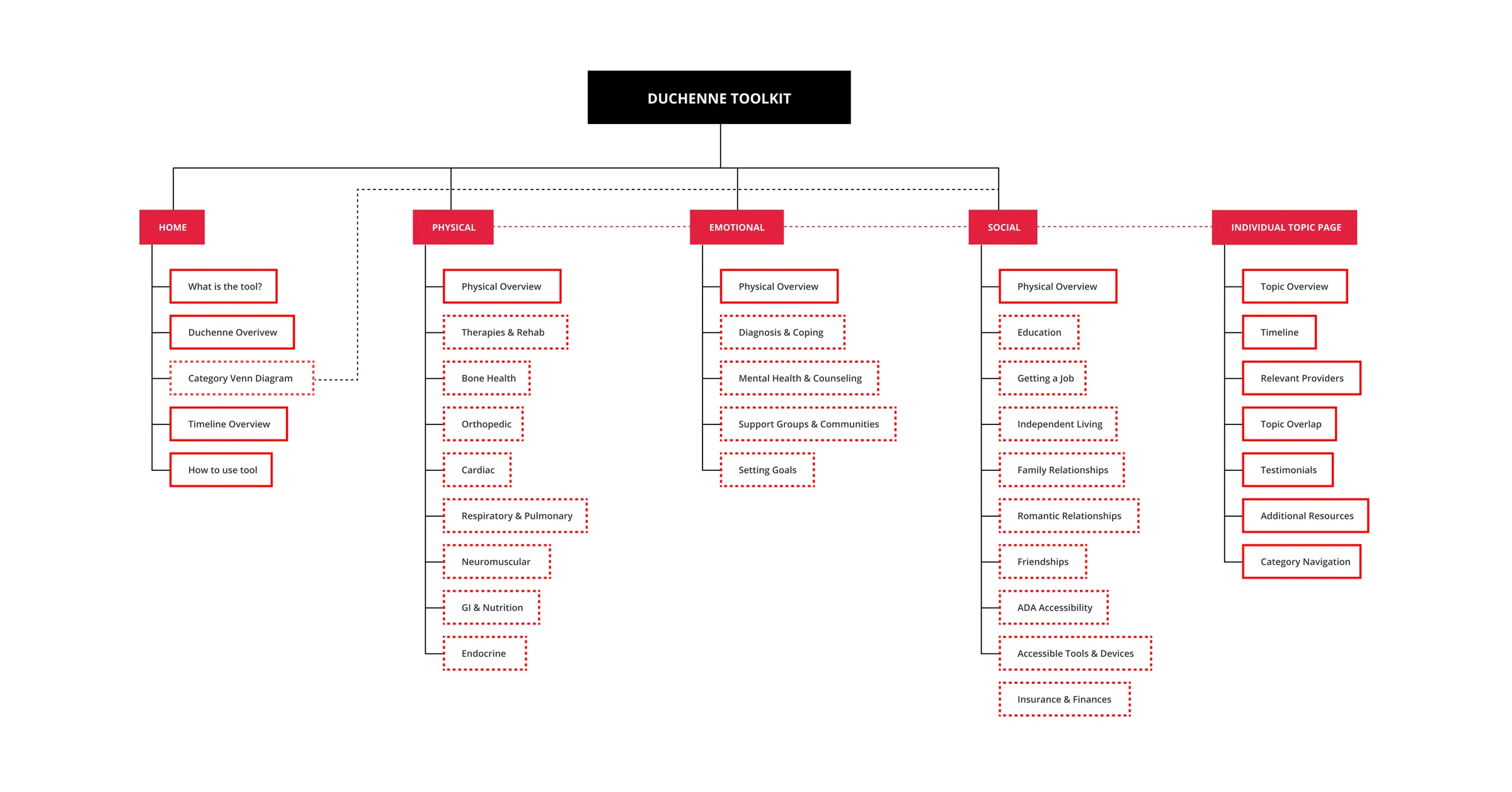
THE STRUCTURE: INFORMATION ARCHITECTURE
Based off of our synthesis of the user interviews we created an initial information architecture that we thought would meet the needs of the users that we spoke with. This is the final version of the “living” artifact that changed as we received more feedback from user testing.
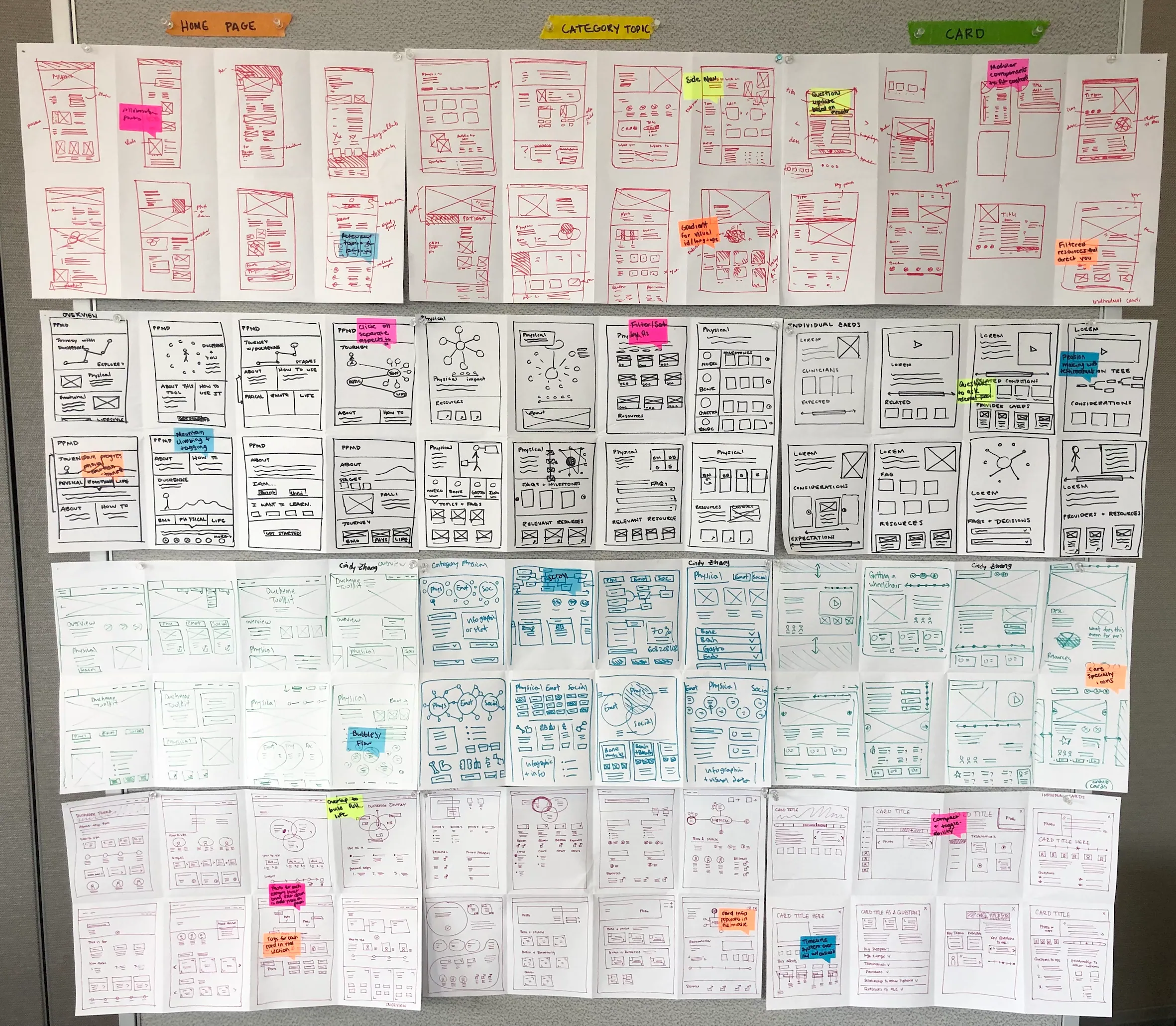
INITIAL SKETCHES: CRAZY 8S ACTIVITY
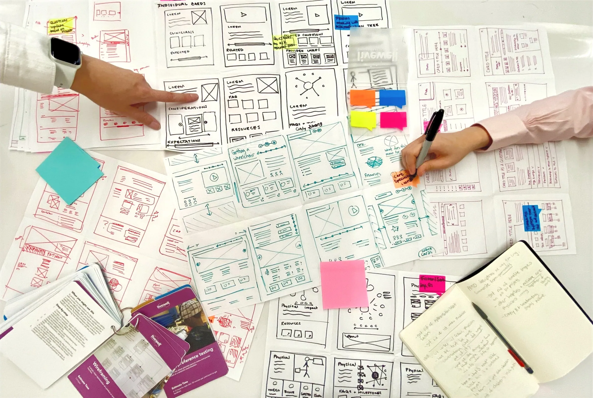
To kick off ideation, the team participated in a crazy 8 activity session where we quickly sketched ideas for potential layouts for specific pages that we identified within the information architecture. After the activity we each explained our ideas and marked our favorite ideas to begin wireframing.
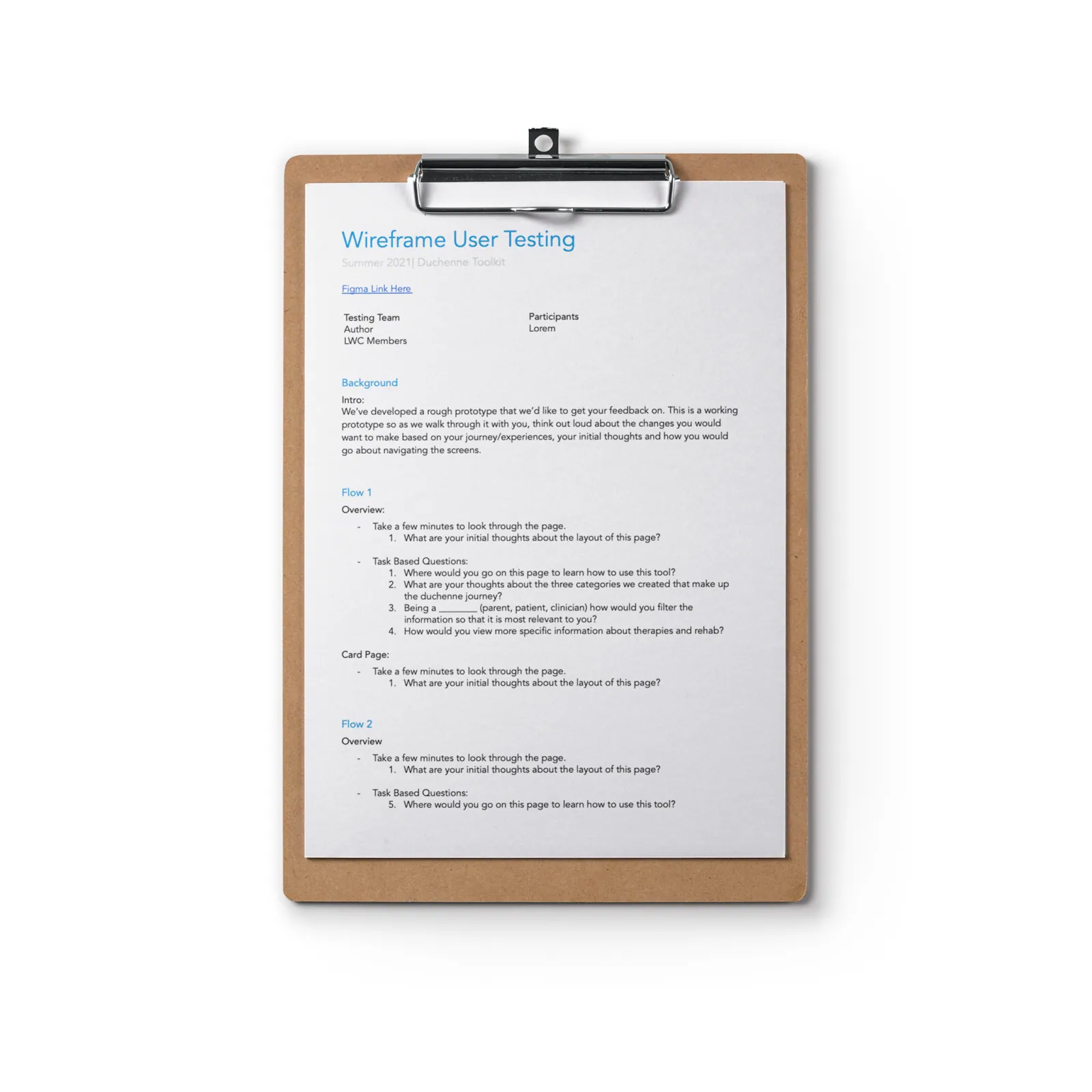
GETTING USER FEEDBACK: USER TESTING
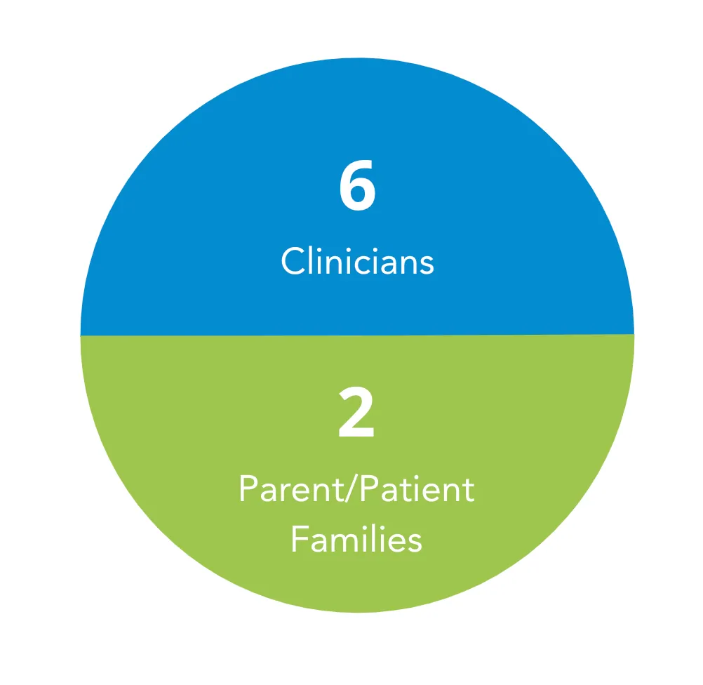
Throughout wireframing and refinement we conducted user tests with patients and families to get feedback about information hierarchy, and different features on the site. We used this feedback to continue changing and refining the site to fit users needs and increase overall usability.
Refinement
FINAL FEATURES: HOME PAGE
Unfortunately, due to confidentiality I am unable to show the final designs that we landed on. However, below are some of the unique features we included within the site called out to give a glimpse into the results of our user testing.
A Venn diagram on the home page shows the three main categories as well as their related subtopics attached to each circle for an overview of the Duchenne journey
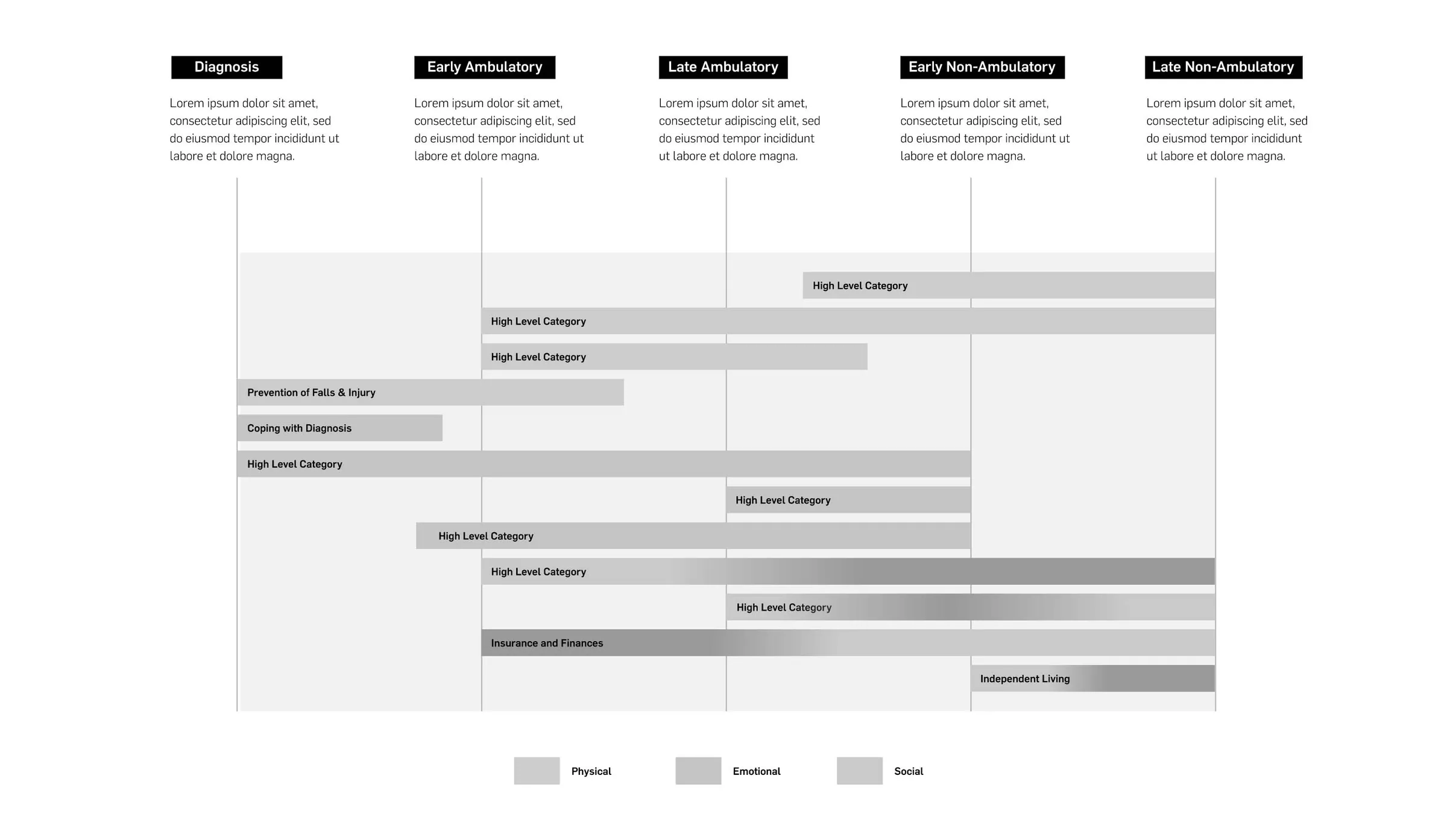
A general timeline of high level items from the physical, emotional, and social categories and when those items typically happen
FINAL FEATURES: TOPIC PAGE
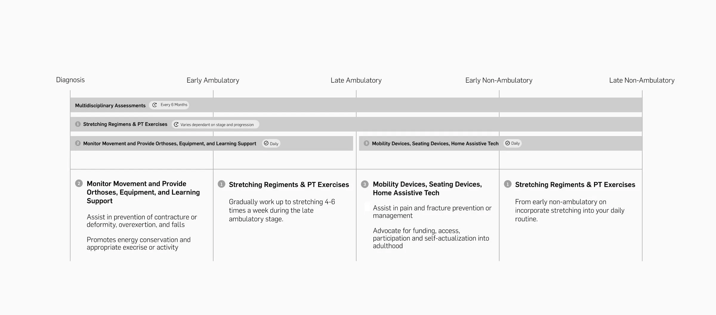
Timeline of the subtopic, how often each item occurs, and when they typically happen, as well as additional notes
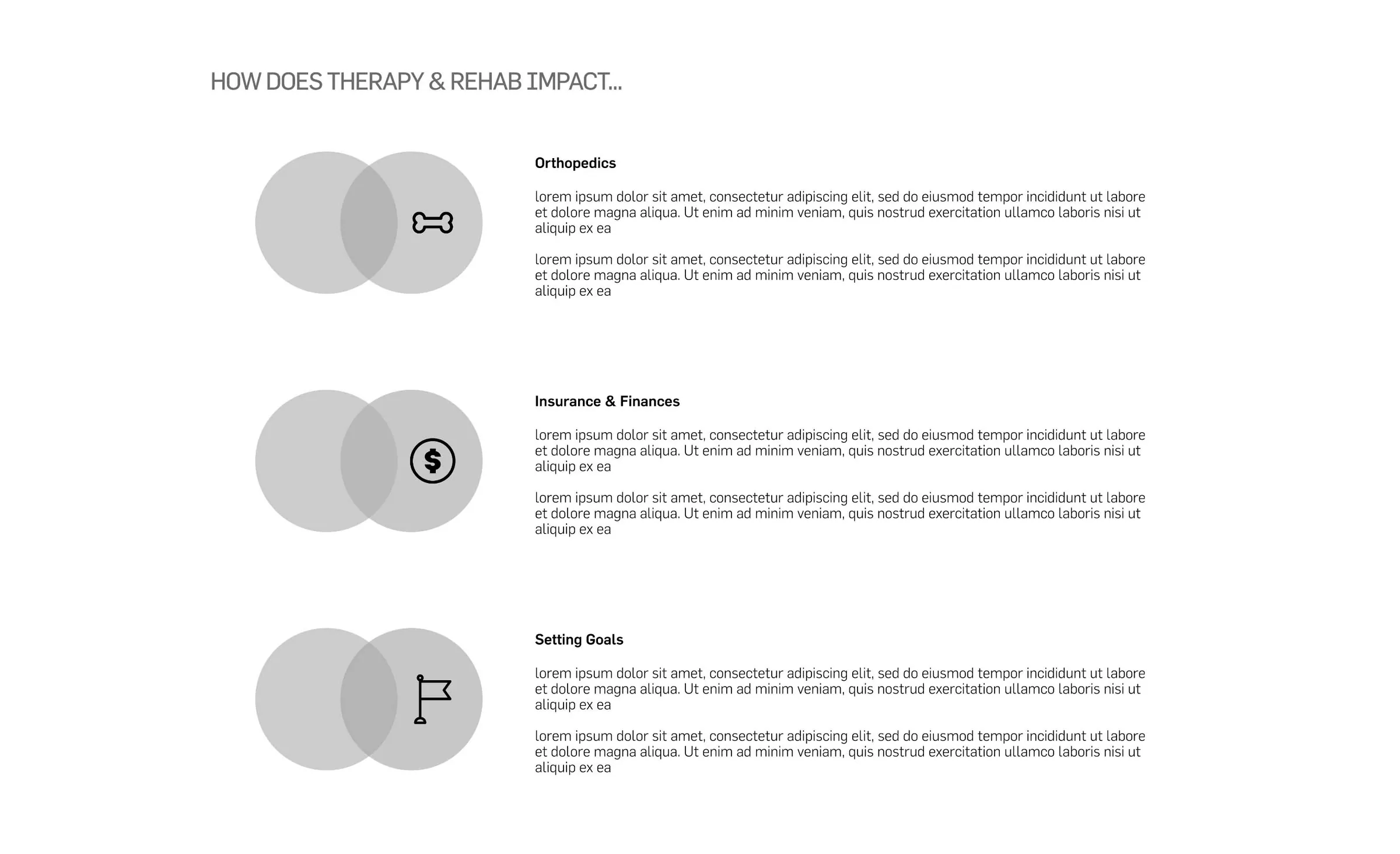
How the subtopic affects other categories in terms of physical, emotional, and social aspects
Conclusion
MY ROLES & RESPONSIBILITIES

- Conducted secondary research to become familiar with the topic space
- Planned and facilitated user interviews and user tests
- Synthesized research findings to define next steps and design requirements
- Created information architecture based on design requirements defined from user interviews
- Quickly sketched iterations of screen designs
- Wireframed screens to test out different information layouts with existing brand
- Created prototypes for user testing



Team: Babaljit Kaur (Design Research Fellow), Cindy Zhang (Design Research Intern), Alexis Begnoche (Design Research Fellow), and me as Design Research Intern.
KEY TAKEAWAYS
Keep it Simple
To enhance user experience of site based on a complex topic space it is important to make interactions as simple as possible and order things in a logical way to let the information stand out and be as helpful as possible to the user
Gather all Perspectives
While the main user group of this site would be DMD patients and their families it is important to take a look at all of the other stakeholders in the process and see how they might affect the end goal of the product.
Information Hierarchy is Key
For this project specifically, it was important to think about how best to organize the information because there is so much within this topic that it can be overwhelming for the users. This is where a lot of the existing sites fall short, so we wanted to figure out how best to overcome this.
Outcome
Built the tool’s information architecture from interviews and a card sort that grouped content into medical, emotional, and lifestyle categories, then refined it through user testing.